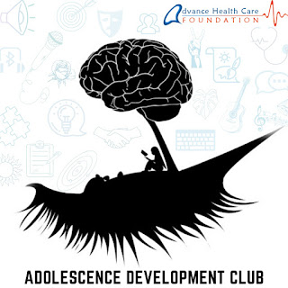
Our Club's Logo Looks like this - Why?
With the newly introduced Adolescence Development Club- created by adolescents, for adolescents- Advance Healthcare Foundation strives to provide a safe space to anyone and everyone who requires it. To reflect our journey branching into several aspects of adolescence development, we have the privilege of revealing our Official Club Logo to our beloved online audience.
To many, a logo might be something which doesn't matter much, but not for us. To the Adolescence Development Club, this logo captures the very heart and soul of all we stand for. As pictured - the adolescent brain has been depicted as a growing tree, branching and blooming into grace while taking its own sweet time. The eyelashes right below the tree stand proof of how our thoughts and ideas provide a platform for personal growth. And last, but not the least, the teenager comfortably settled under the tree of thought signifies each one of us part of this initiative, moving and working on our own pace and supporting each other.
This logo, in its entirety, stands for all the Adolescence Development Club is - a group of teenagers coming together to solve the puzzle of adolescence through their skills- be it writing, videography, graphic designing or event and relationship management! As a team, we strive to give our all to the enhancement of adolescent health, come what may.


This is thoughtful and amazingly designed!
ReplyDeleteGreat thought!
ReplyDeleteWell written.
ReplyDeleteExcellent 💯💯
ReplyDeleteNiceee
ReplyDelete